In my second year at Simon Fraser University, I was able to take in part of the Information Design course (IAT235) and further develop my skills as a designer in the design process: the exploration of design options, taking in feedback and redesigning, creating aesthetically pleasing and informative presentation slide decks, where I was forced to put extreme attention to detail and considering how users will interact with my designs to provide an overall polished product.
Introduction
Design Process
This project was done with a teammate, Agastya.
Main Roles:
Jihoon - Design, Mockups, Revisions
Agastya - User Research and User Testing
Tools:
Figma, Adobe InDesign, Discord, Google Docs
Timeframe:
3 weeks
Objectives:
Build intuitive and minimalistic design for
DLDK festival application that users will love.
Since the "Don't let daddy know" music festival does not have a dedicated application made for mobile devices, our group had to start from the base, researching. We had to figure out what users want, how hypothetical competitors in the market do it, and how to combine all the necessary information and turn it into an aesthetically beautiful yet functioning application.
User research
Typical user age range
18-26
Events
EDM, Concerts, Music festivals, Rock festivals, Nightclubs
Qualities they looked for
Dark-themed UI, Easy to navigate UI, Large fonts and buttons, Quick access to main features

DLDK Festival App
Research
prototyping
2021
UI Design
After gathering the information we needed, I started with my design ideas and explored various options. I began the design process with low-fidelity sketches to quickly explore different ideas and concepts. As we refined our ideas, we progressed to creating wireframes and wireflows to map out the layout and user flow of the interface. Having multiple meetings on which design we liked the best, we settled on this design for the first evaluation.
Our first attempt at creating DLDK application focused on providing essential information that a user might need: the events page and passes page. This approach has allowed our team to emphasize our design focus on creating as minimalistic design as we can while providing all the necessary information a user might need.
Home page.
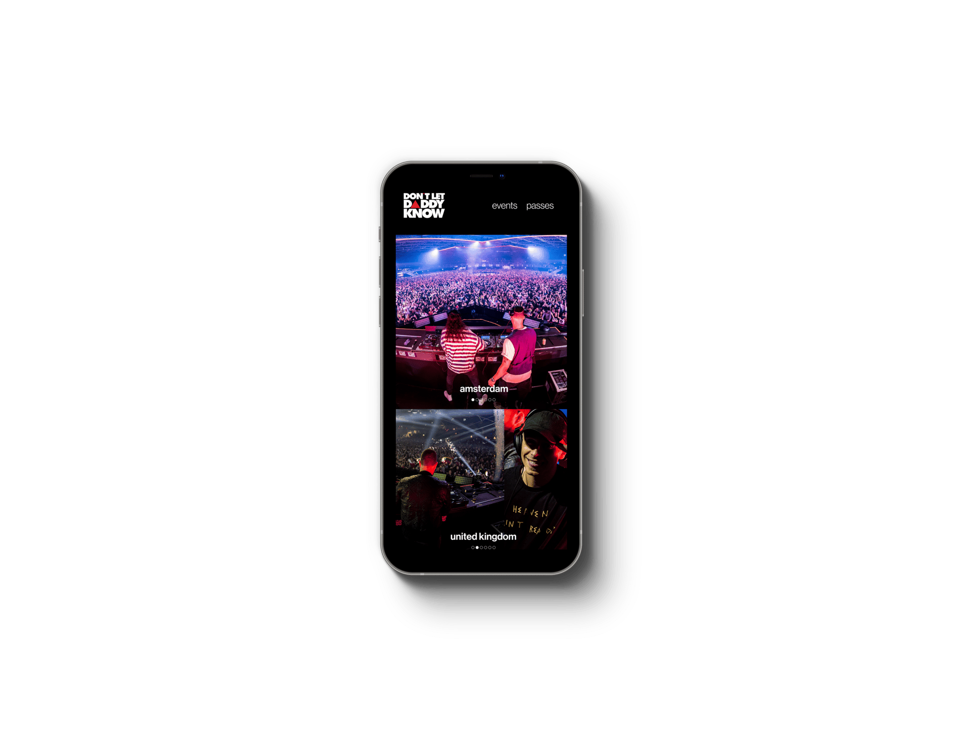
Events page.
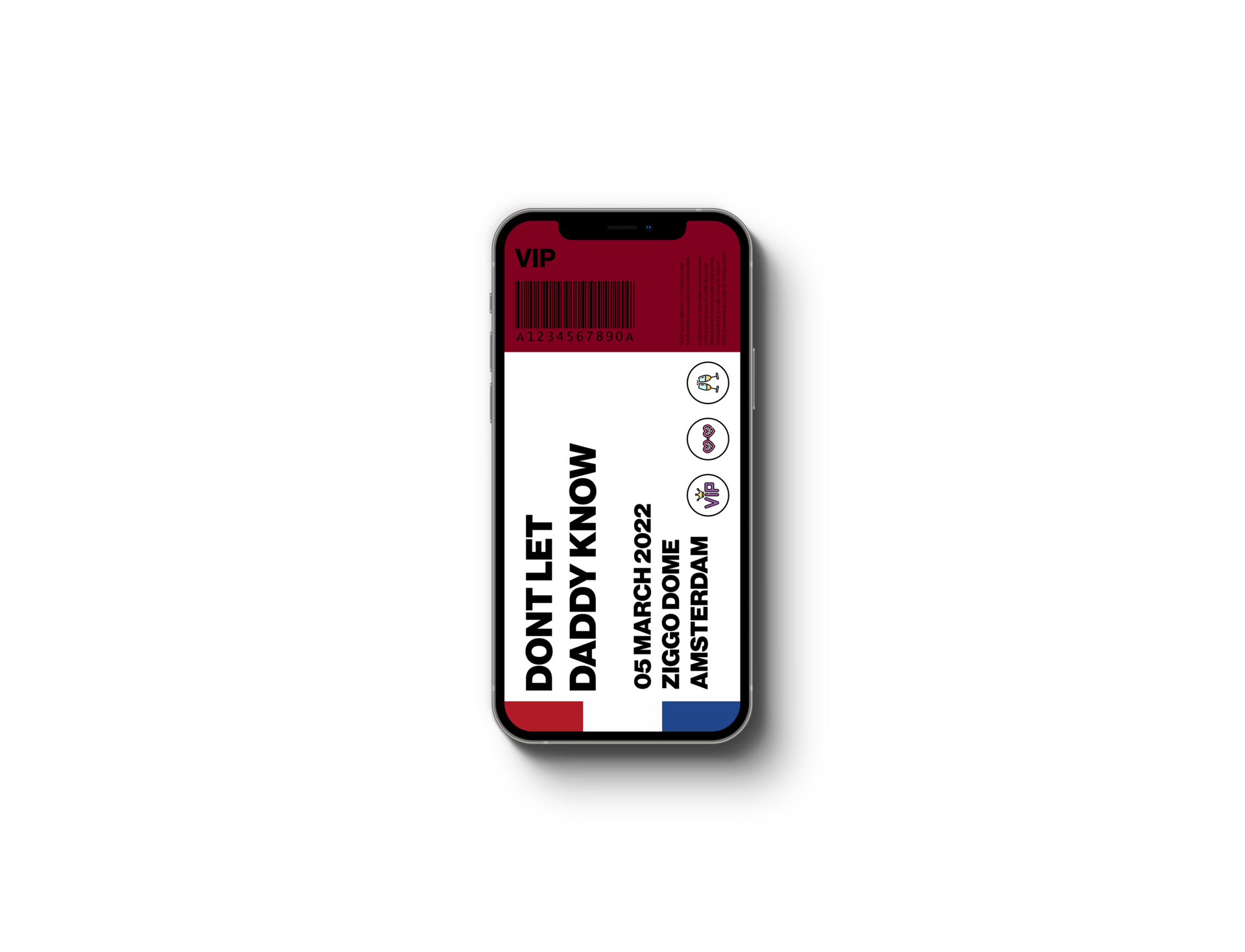
The passes page provided a way for users to check privileges of their tickets, showing general information about the event, additional information on the bottom showing the exact location, helpful information on how to get to the festival by transit and personal vehicle.
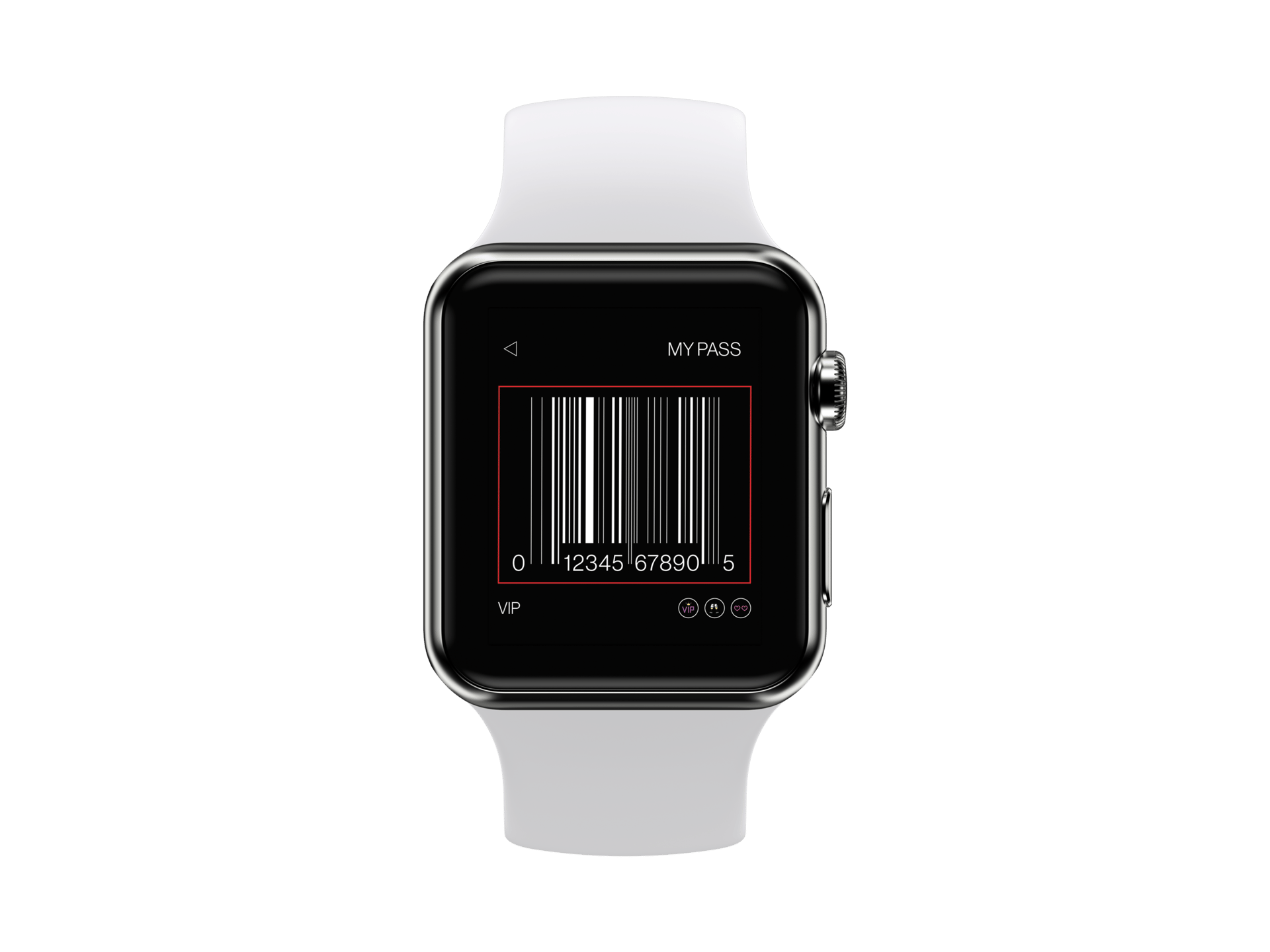
The digital ticket was also designed and can be full-screened when tapped on. The digital ticket carries the festival's name, date, location, and the type of ticket labeled as VIP or General, with a scannable barcode that can be used when entering the festival.
My pass page.

Ticket.
Considering all of the feedback we have received, we have completely redesigned our application to better satisfy the needs of the users.
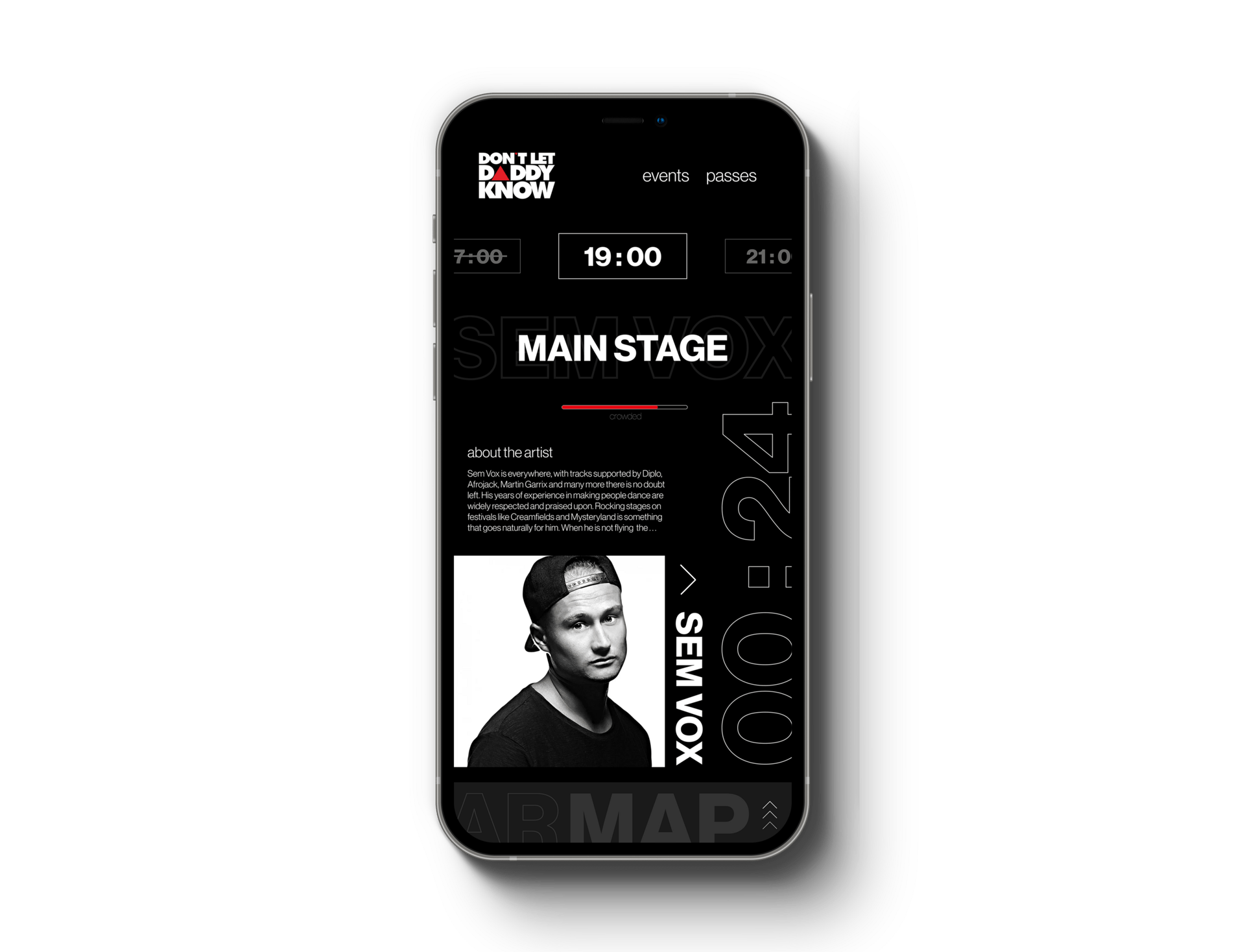
The home page was designed to provide more useful information, and a way of immediately informing the users of what they need the most: the ongoing and upcoming performance, the location of the performance, the artist, and their information.
The concept of an AR Map feature was also added to this redesign, where users can see where their friends are and a way of AR navigation throughout the festival.
The events page has been drastically redesigned to better provide for the users, while the passes page went under minimal style adjustment.
Redesign
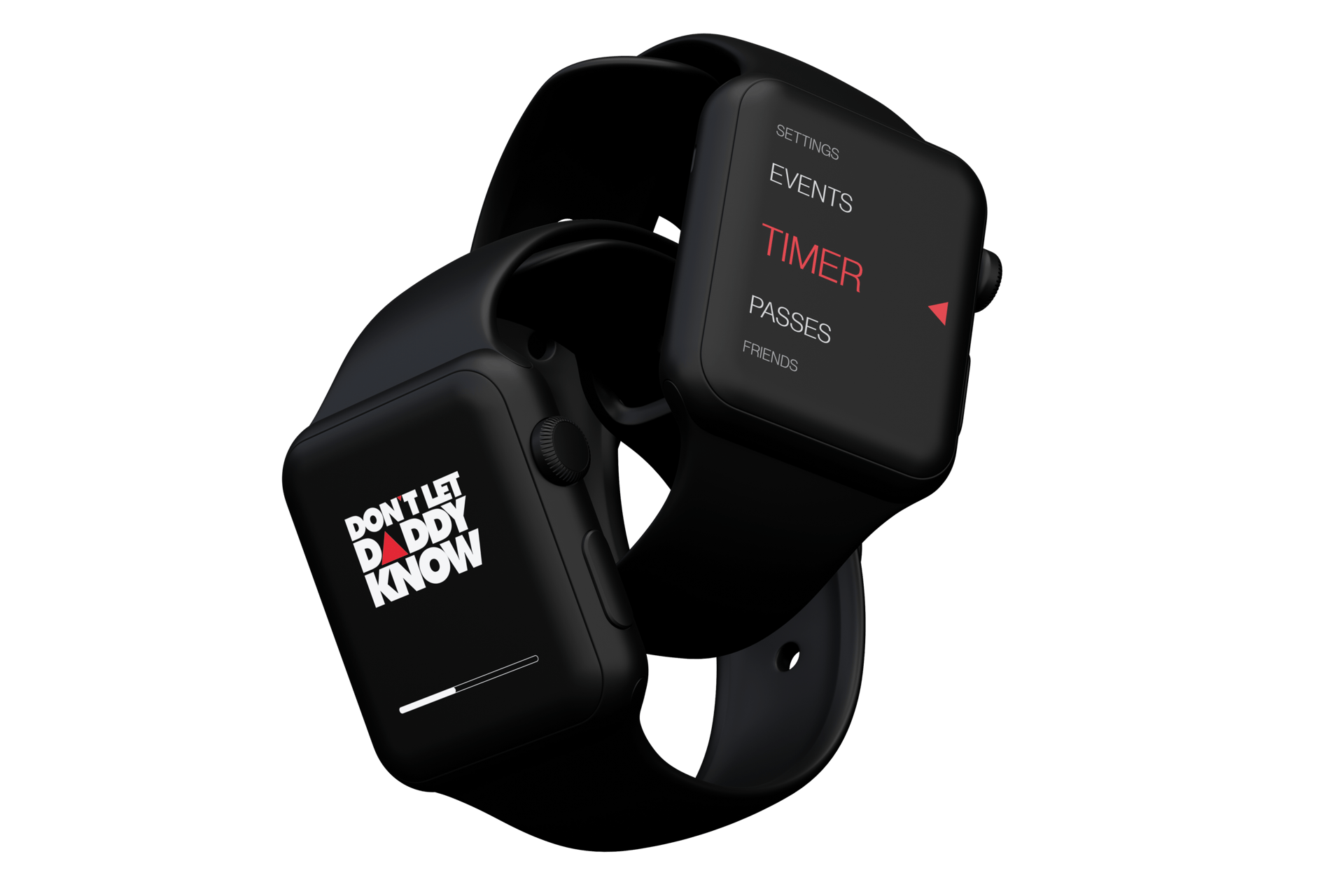
apple watch ui
Redesigned home page - ongoing event.
Redesigned home page - upcoming event.
The new home page serves more purpose than the previous version in many different ways. Our team wanted to create a homepage that serves an immediate purpose when users launch our application, and we concluded with this redesign.
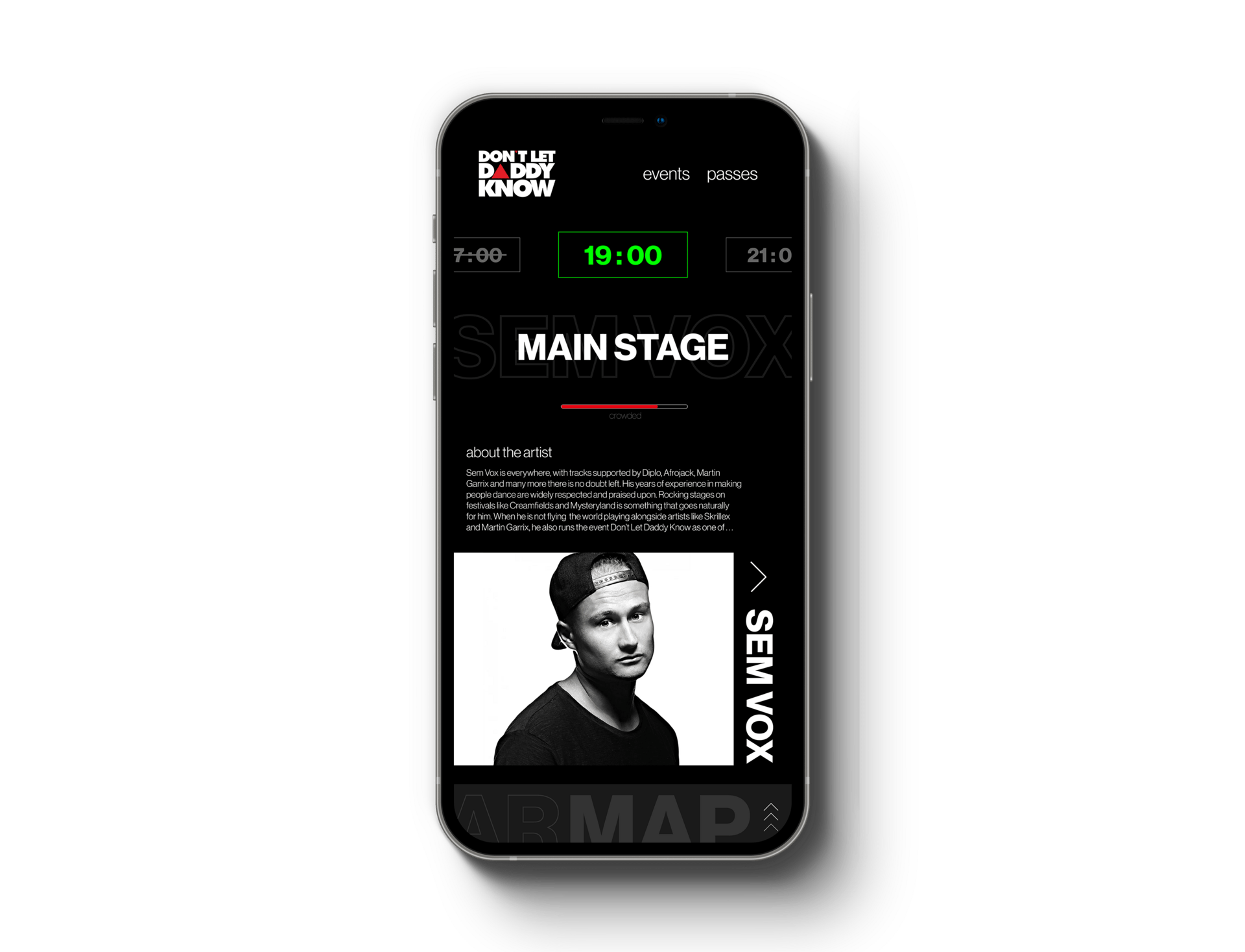
Our main page is now not only more informative, but more interactive and continuously changing its form. When there is a currently ongoing event at the festival, it will highlight the time in green, indicating that the performance is live. In contrast, when the event is upcoming, it will display a countdown toward the event time and the time will be displayed in white color instead.
The main page also presents the location of the stage to better indicate where it is being held, and how crowded it is through a progress bar in multiple colors: green for sufficient space, yellow for relatively-crowded space, and red for very-crowded space. It also has information about the performer that a user can press to access further information.
On the very bottom, the AR Map function is added to the new design to better help users navigate through the festival who may not be familiar with the location.
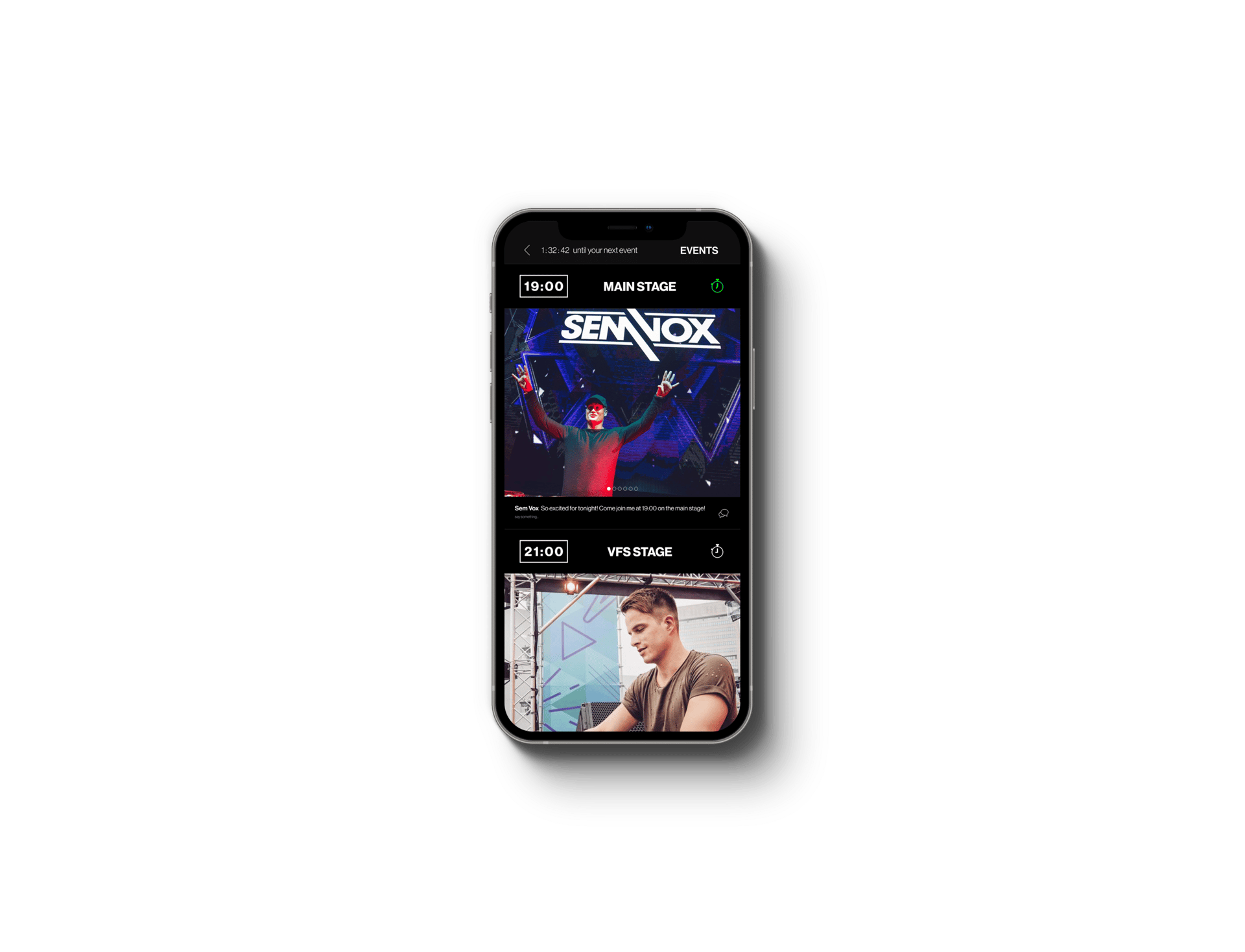
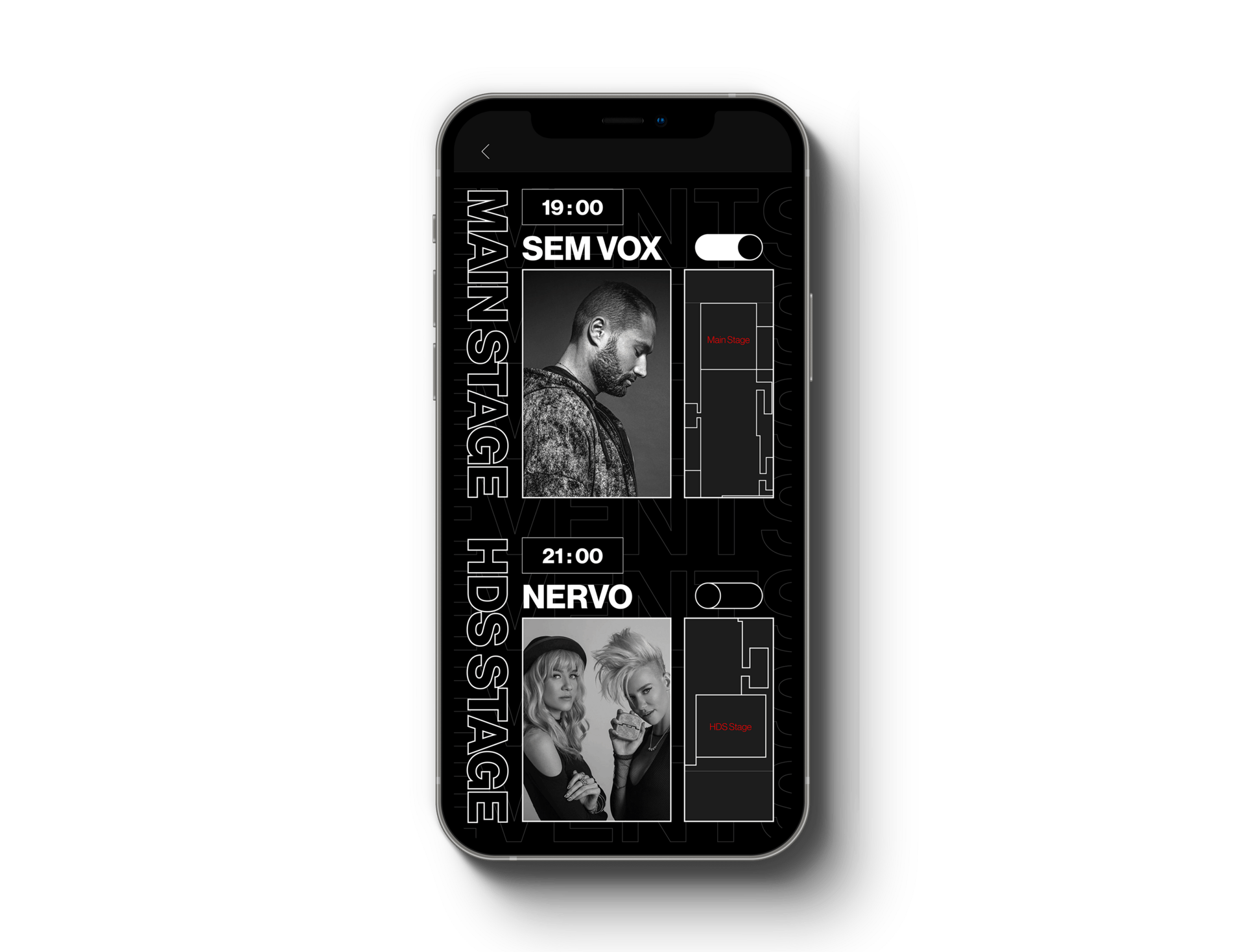
The new events page emphasizes the stage location, artist, and time, with a timer feature in a bigger and simpler form.
The artists' selected photos will be presented, along with the location of the performance in a visual manner with a 2-D map on the side.
The 2-D map can be interactive when tapped and provide a shortcut of the AR Map.
The new design layout is cleaner and more informative compared to the old design, clearly showing the necessary information for the users.
Redesigned events page.
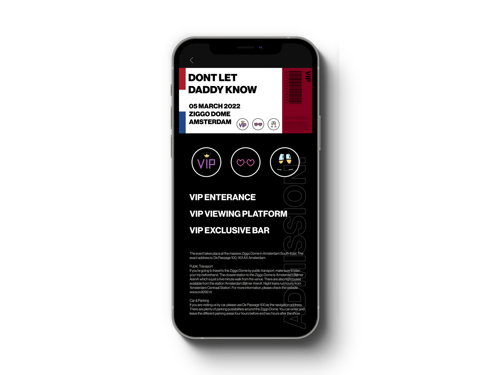
The passes page kept its design layout with minimal stylistic adjustments.
The main change was on the font sizing and background styling, the font size was increased to help readability while making better use of the free space available on the display. Additional information on the bottom was readjusted to better fit necessary information while keeping in mind of rags.
The ticket design was unchanged.
Redesigned my pass page.
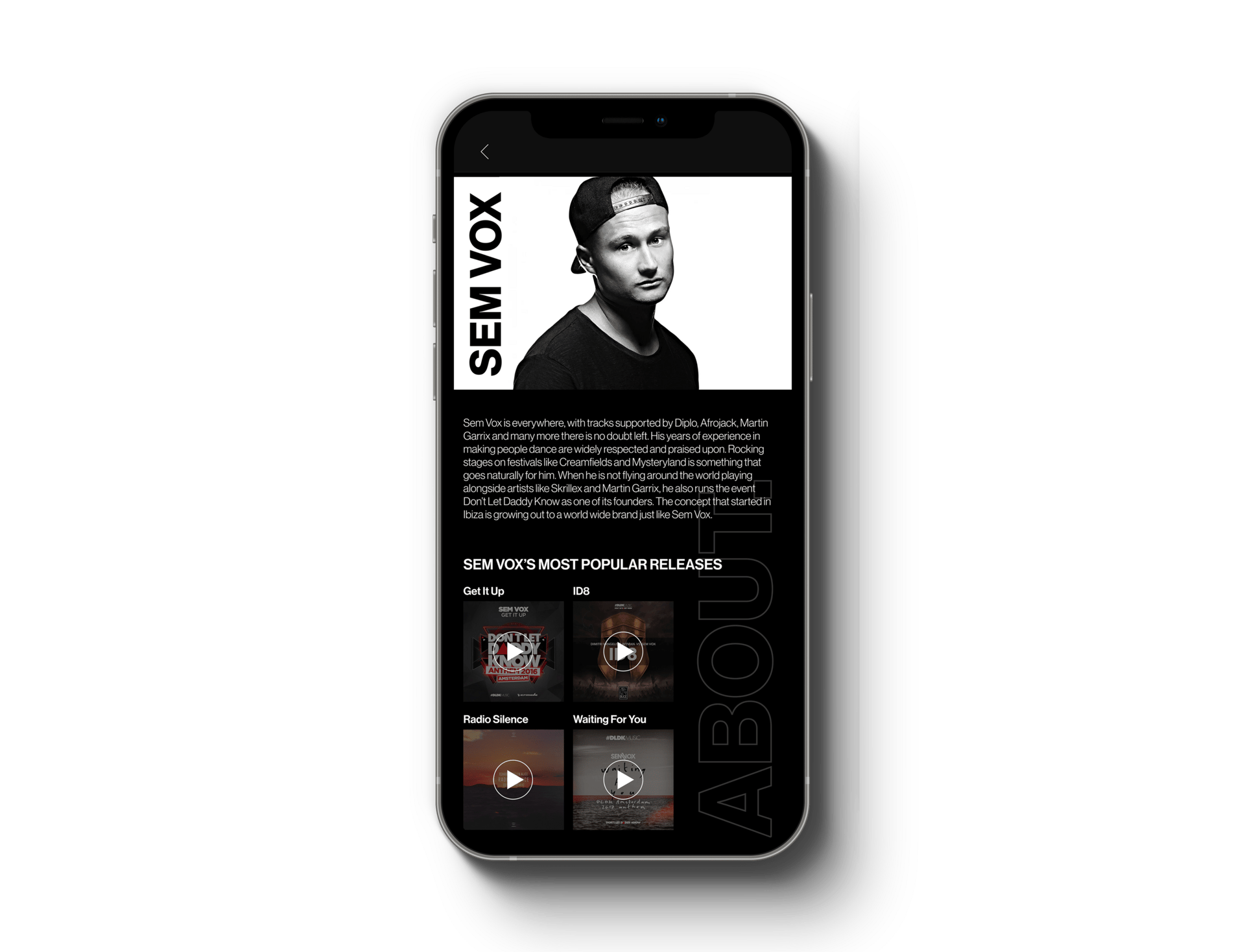
The artist page was also added with the redesign with the addition of performers' information on the main page. When user taps on "About the artist", a page that gives brief information about the artist, along with a list of artists' most popular releases.
Through this way, users have another way to interact with the app and the app to provide for the users, and make the overall experience at the festival more meaningful, enjoyable, and memorable.
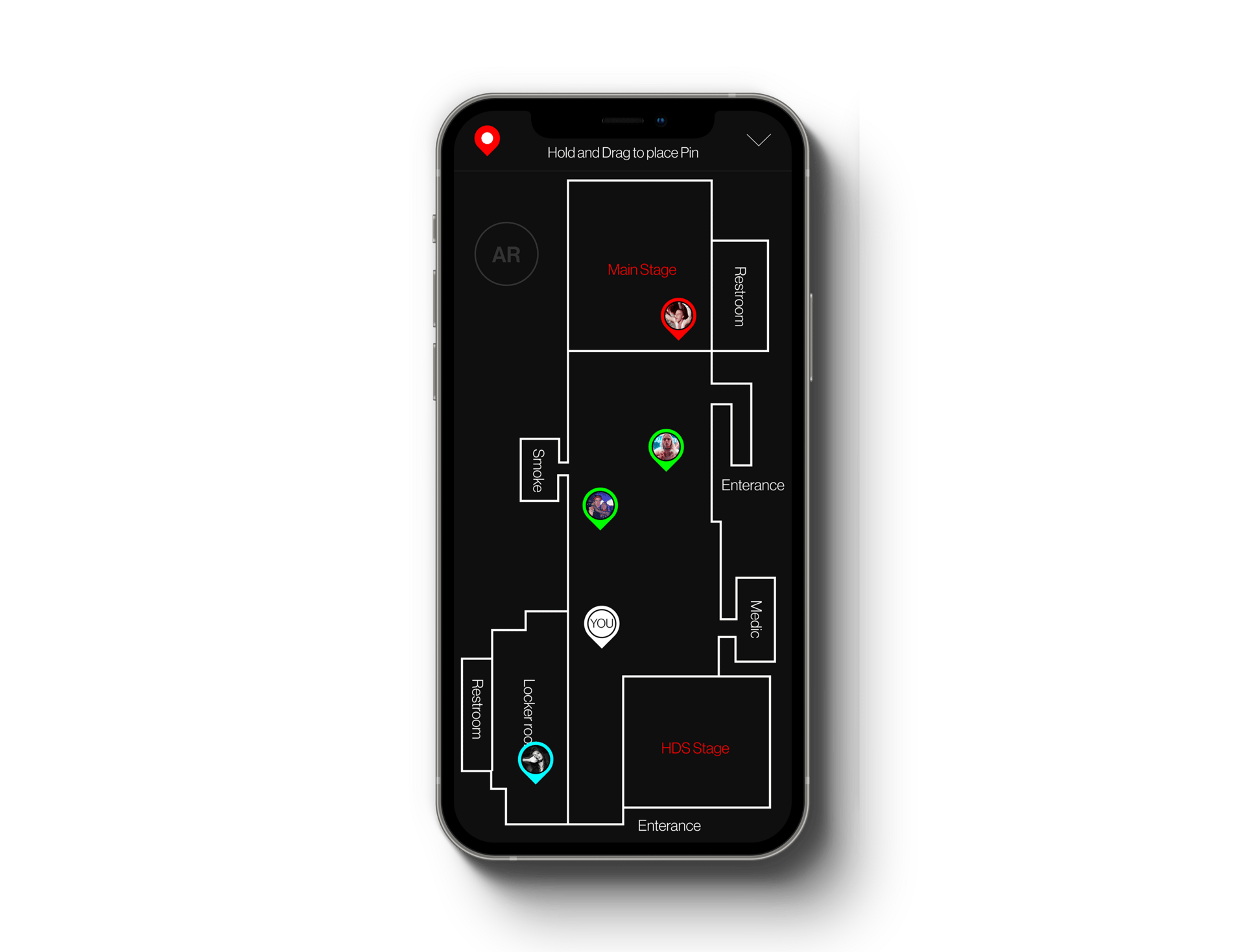
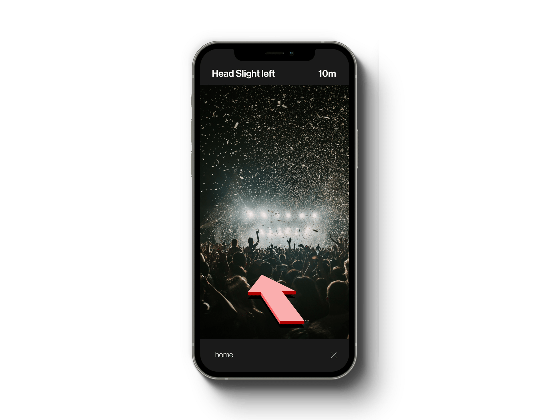
The idea of implementing an AR Map throughout the festival was also added to the redesign, to better help users move around the festival even when they might not be very familiar with the environment.
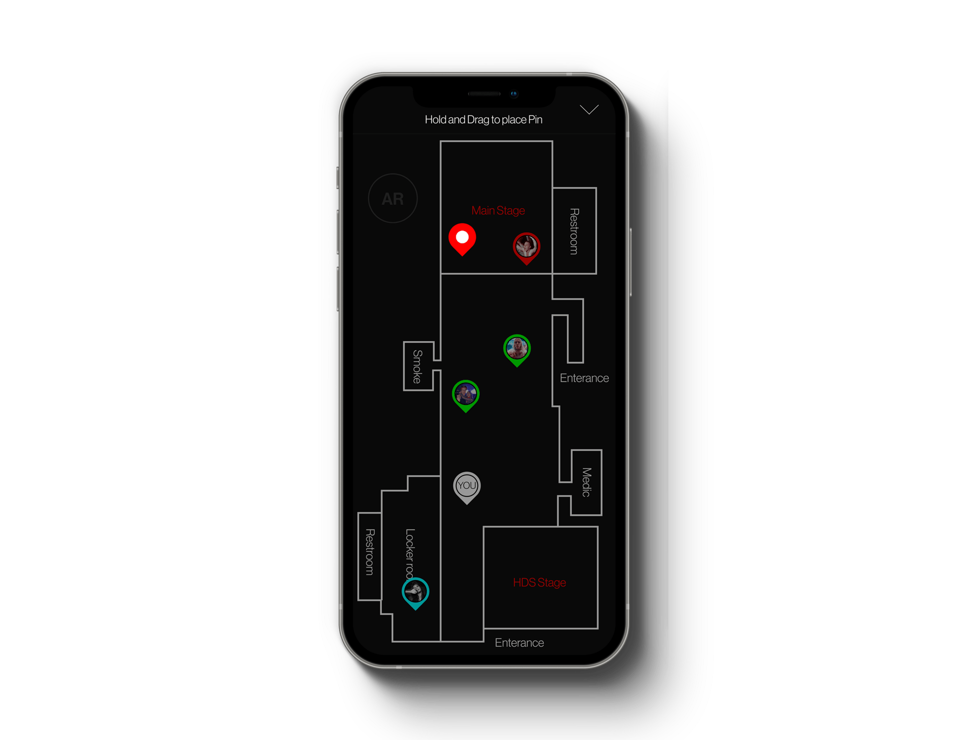
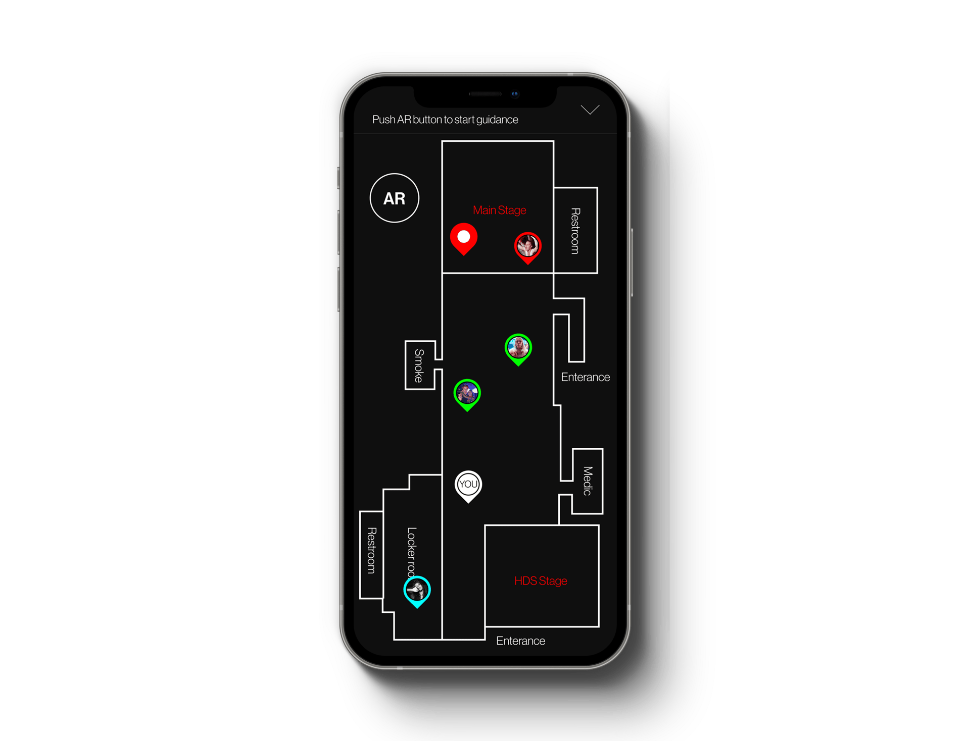
To use the AR feature, users will hold and drag on the pin icon and release it on the location they would like guidance to. This includes any pin-pointed areas to marked locations such as the restrooms, smoke room, medic room, locker room, and the performing stages. When the pin is dropped, the AR button will become available, and the guidance will begin when it is pressed.
The AR Map feature, when implemented, will provide a faster and more convenient way for users to move around the festival and it can also be used in an emergency when someone is needing medical help.
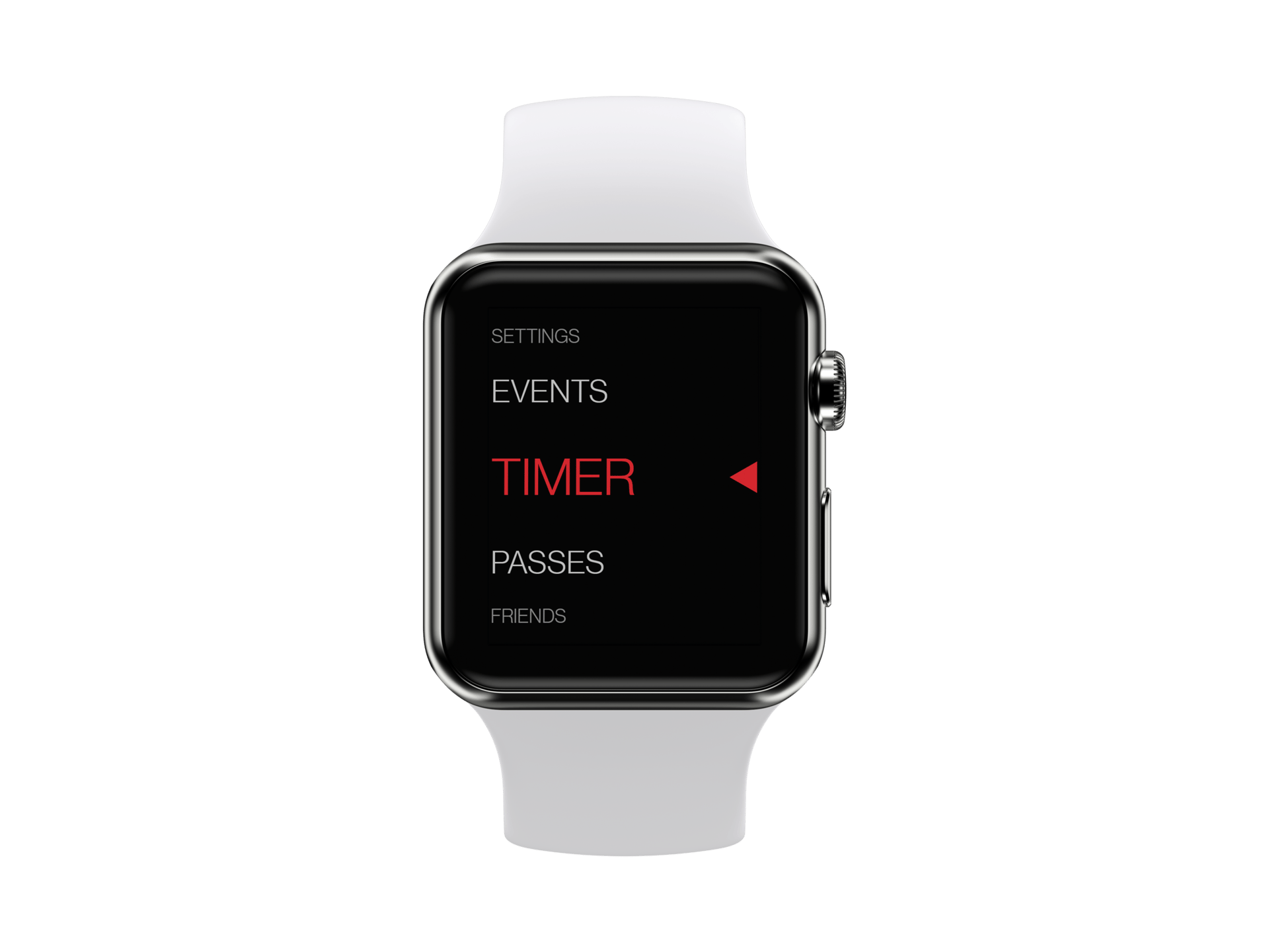
I was also tasked with creating an intuitive and user-friendly interface for an Apple Watch to be used at a music festival. With the goal of providing essential features and functionalities that festival-goers would need, Agastya conducted research to understand the behavior and preferences of music festival attendees.
Based on feedback from interviewees, I focused on designing an interface that would provide easy access to features like ticket scanning, schedule viewing, and messaging.
Given that many attendees preferred to only carry a smartwatch, I designed the interface to be easily navigable using the Apple Watch's digital crown and touch screen, with intuitive swipe gestures for switching between features. I used a strong red theme color and clear, easy-to-read text to create a visually appealing and user-friendly interface.
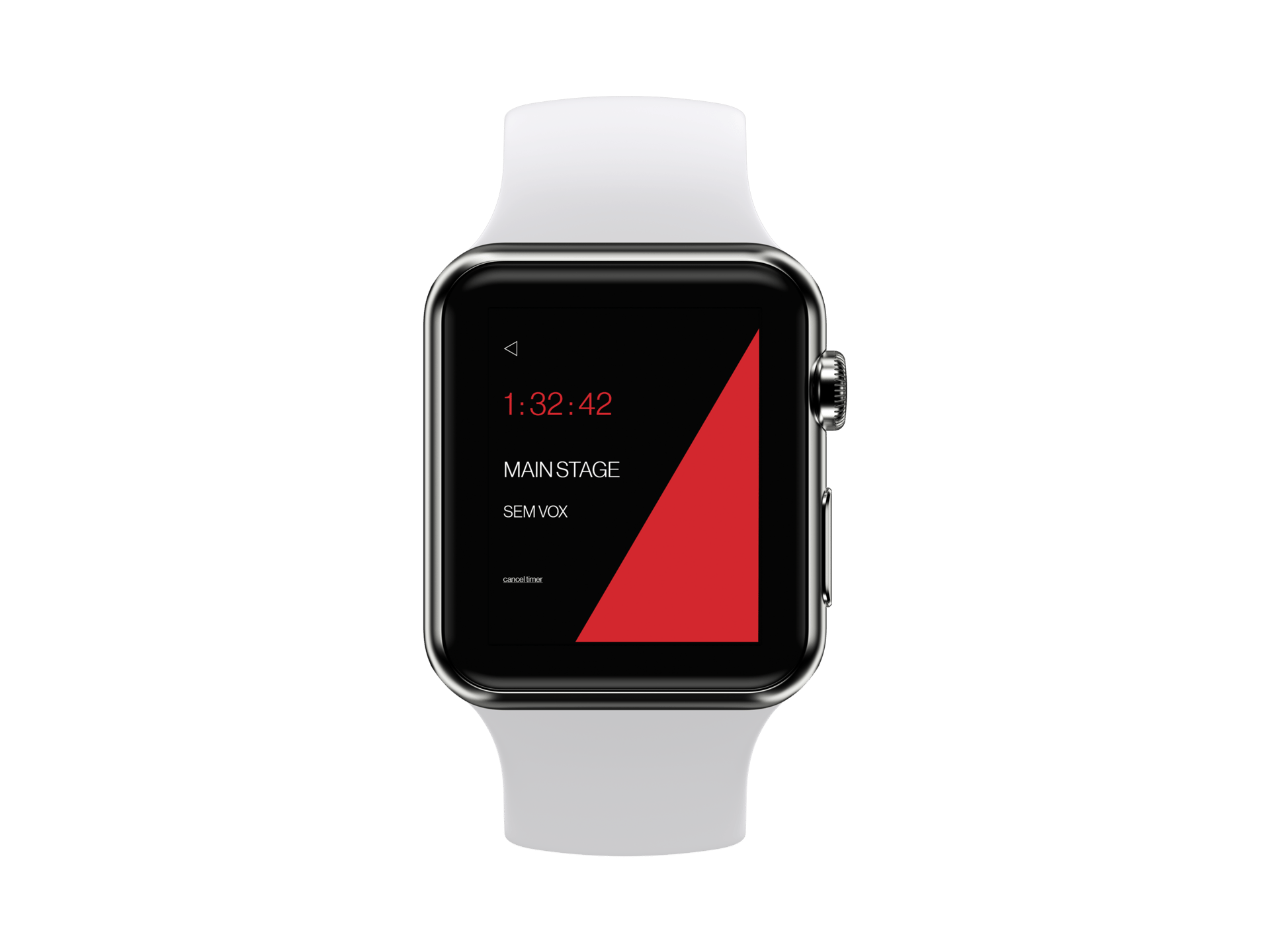
As the project progressed, I added a "Find My Friends" feature that allowed users to locate their friends within the festival grounds, and a "Now Playing" feature that provided information about the current song being played on the main stage.
Challenges
As a team, we encountered several challenges during the festival app project. The first hurdle was finding the right individuals to interview and gather valuable feedback from. While understanding their needs was crucial, we also had to strike a balance, ensuring we didn't overly focus on just one subject's preferences.
Scaling problems arose as we ventured further into the design process. Designing solely on the computer monitor limited my ability to accurately evaluate the right ratio and readable font sizes for the mobile environment. This forced our team to be creative in finding solutions and validating our designs across various devices, such as using Figma to preview the design on mobile devices and downloading high-fidelity PNG files for validation.
Amidst the creative process, the pressure of meeting the deadline loomed overhead. Crafting a modern, simple, clean, and user-friendly design demanded considerable time and effort. As the clock ticked, we found ourselves navigating the fine line between perfection and timely delivery, pushing our skills and collaboration.
what we would do differently
Reflecting on the festival app project, there are several key aspects we would approach differently if given the opportunity. With improved proficiency in software and increased efficiency gained over time, we would make the most of our extra time to conduct more in-depth user research. Understanding the target audience on a deeper level would empower us to harness our UX skills effectively and build an application that stands out in the market competition.
Additionally, we would focus on generating a wider range of design variations that cater to users' diverse needs more comprehensively. This approach would ensure that the final design encompasses a greater spectrum of usability and caters to a broader audience, thereby enhancing the app's overall appeal and user satisfaction.
The music festival project was an exciting opportunity for me as a UI/UX designer, where we designed both a mobile application and an interface for an Apple Watch. The mobile application was the primary focus of the project, and we worked collaboratively as a team to design an intuitive and user-friendly interface that met the needs of festival-goers.
The mobile application provided essential features and functionalities for festival-goers, such as ticket scanning, schedule viewing, and messaging. The interface was designed to be intuitive and easy to use, with clear, easy-to-read text and vibrant colors. The interface for the Apple Watch was a secondary focus of the project, but it was still an important part of the overall design.
Overall, this project allowed me to grow as a designer, refining my skills in user research, wireframing, prototyping, and visual design. It exemplified the importance of designing with intention and keeping the user at the forefront of the design process.
I am proud of the final product we created, with a mobile application that met the needs of festival-goers and an Apple Watch interface that will enhance the festival experience for users. As I move forward in my career, I will continue to apply the lessons learned from this project, striving to create user-friendly and visually compelling designs that meet the needs of their intended users.
conclusion
New artist page.
AR Map - drag pin from top-left.
AR Map - drop pin to place.
AR Map - activated AR button.
AR Map - AR map initialized.
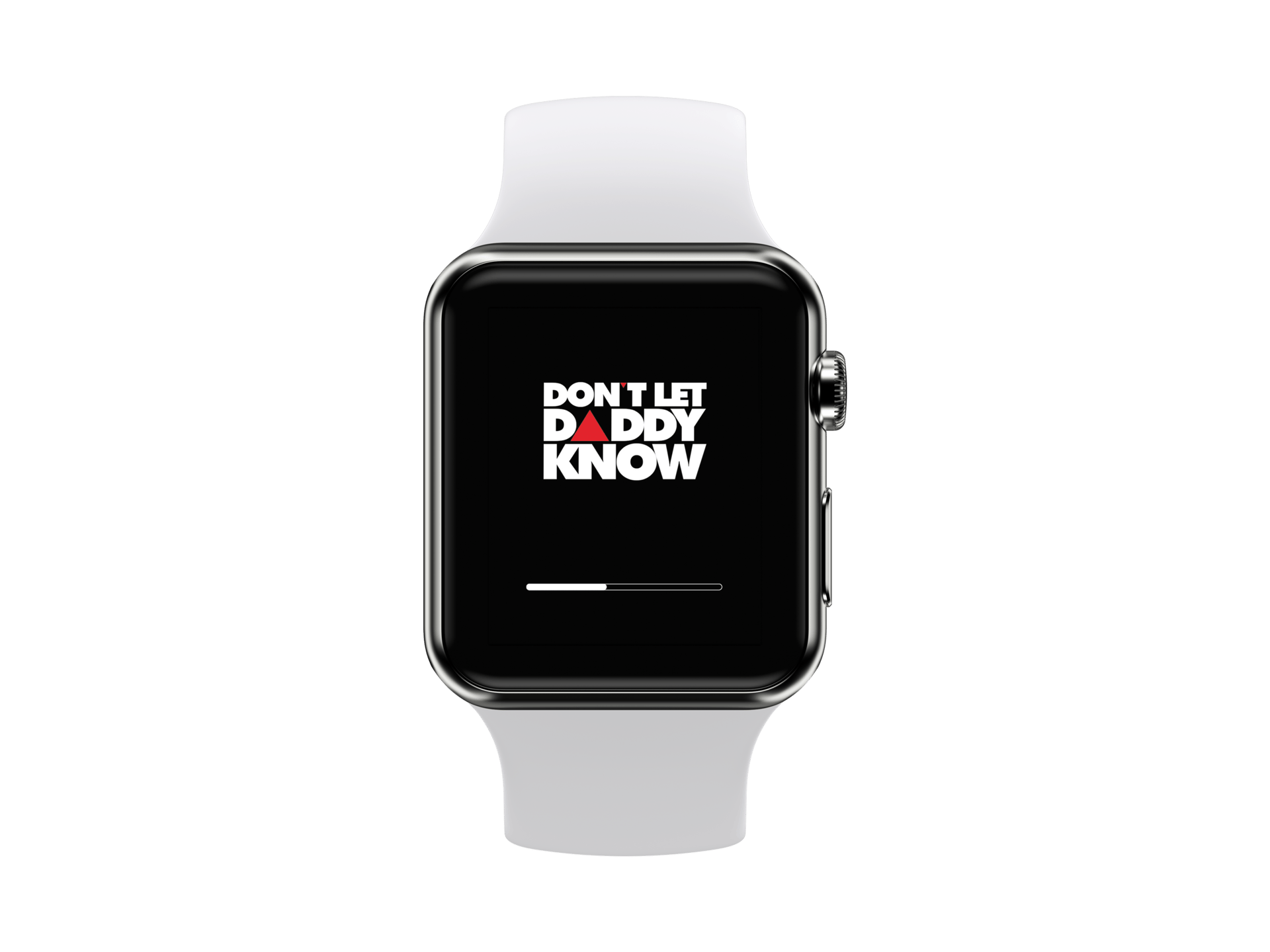
Apple watch loading screen.
Apple watch login page.

Apple watch home page.
Apple watch events page.
Apple watch my pass page.
Apple watch friends page.

Apple watch home page.